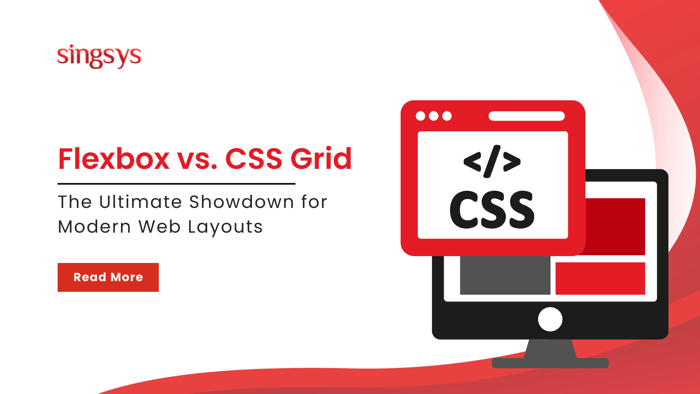
Creating responsive, efficient, and visually engaging web layouts is a priority for today’s developers. In 2025, two CSS layout models—Flexbox and CSS Grid—have become indispensable in modern web design. While both tools are widely adopted, understanding their distinct use cases and strengths is crucial.
This article presents a detailed comparison between Flexbox and CSS Grid, offering insights into their optimal applications, layout philosophies, and how they work together to build seamless, responsive interfaces.
Understanding the Core Difference: One-Dimensional vs. Two-Dimensional Layouts
At the heart of Flexbox and Grid lies a key distinction: Flexbox is designed for one-dimensional layouts, while Grid supports two-dimensional design.
Flexbox arranges items in a single direction—either as rows or columns.
Grid handles both rows and columns simultaneously, offering a more structured layout system.
This core difference defines how each method is best applied in responsive design.
CSS Flexbox: Efficient One-Dimensional Alignment
Flexbox is particularly well-suited for layouts where elements align along one axis. Whether building a navigation bar, aligning items in a card, or creating button groups, Flexbox provides intuitive control.
Use cases include:
Horizontal navigation menus
Vertically stacked form elements
Even spacing within containers
Mobile-first, adaptable layouts
Flexbox works from a content-first perspective, adjusting to the size and distribution of its content. This dynamic behaviour makes it a reliable choice for components with unpredictable or flexible content lengths.
CSS Grid: Structured Two-Dimensional Design
CSS Grid offers advanced capabilities for layouts that require precise control over rows and columns. It allows developers to design rigid structures where content fits within predefined grid areas.
Ideal for:
Full-page layouts (header, sidebar, main content, footer)
Product galleries
Dashboards and data visualisations
Magazine-style interfaces
Unlike Flexbox, Grid follows a layout-first philosophy, establishing a framework that dictates where and how content is displayed. This enables consistency across screen sizes and devices.
Why Layout Choice Matters in 2025
As of 2025, mobile devices account for over 60% of global web traffic, while desktop users contribute to deeper content engagement. High-speed internet and the growing popularity of Progressive Web Apps (PWAs) have raised user expectations for fast, app-like browsing experiences.
To meet these expectations, developers are increasingly combining Flexbox and Grid to deliver both flexibility and structure. This hybrid approach supports optimal user experiences across various devices and screen sizes.
Philosophy of Layout: Content-Out vs. Layout-In
A clear understanding of each method’s layout philosophy supports better decision-making:
Flexbox: Content-Out Approach
Flexbox prioritises content, allowing it to influence layout. It’s like packing a bag—you add items, and the layout adjusts accordingly. This approach is particularly useful for UI elements that vary in content size, such as buttons or form inputs.
Grid: Layout-In Approach
Grid, on the other hand, establishes the layout before content is placed, like setting up compartments in a bento box. Content fits into the structure, ensuring uniformity and precision.
Both methods support responsive design but cater to different types of content organisation.
Alignment and Sizing Capabilities
Flexbox: Group Alignment
Flexbox excels at aligning groups of items. It offers properties like justify-content and align-items, making it ideal for distributing space evenly or centring content along a single axis. This feature is especially valuable in mobile design, where alignment consistency enhances usability.
Grid: Precise Placement
Grid enables exact positioning of items within their respective cells. Developers can align content to the start, centre, end, or stretch it across a cell. This level of control is critical for designing complex interfaces that must maintain symmetry and structure across various devices.
When to Use Flexbox and When to Use Grid
Understanding when to apply each method can improve development efficiency and design effectiveness.
Use Flexbox When:
Building navigation bars or toolbars
Aligning items in a single row or column
Designing components with dynamic or variable content
Speed is a priority in development
Use Grid When:
Creating entire page structures
Designing layouts that require alignment across both axes
Building interfaces like dashboards or image galleries
Consistent alignment and spacing are essential
Quick Rule of Thumb
If you’re struggling to align items across rows or columns using Flexbox, it may be a sign that your layout is inherently two-dimensional. In such cases, switching to CSS Grid is often the better solution.
Responsive Design in Practice: A Card Gallery Example
Consider a typical use case: a gallery of cards.
Flexbox can wrap items into new rows, but the final row may stretch unevenly, creating visual imbalance.
Grid, with its structured columns, maintains alignment and spacing, even if the last row contains fewer items.
Using Grid ensures a consistent, professional appearance across all devices.
Best Practices for Responsive Layouts in 2025
Use Grid for page scaffolding: Apply repeat(auto-fit, minmax(250px, 1fr)) for fluid layouts.
Use Flexbox for inner alignment: Align elements like images, titles, and buttons within Grid cells.
Prioritise content-based media queries: Focus on content breakpoints rather than device types.
Optimise performance: Incorporate responsive images and lazy loading for improved load times.
Using Flexbox and Grid Together: A Modern Strategy
Rather than choosing one layout method over the other, developers in 2025 often use both. This layered strategy improves maintainability and ensures responsive behaviour across components.
Grid handles the macro layout—headers, footers, sidebars, and content zones.
Flexbox handles the micro layout—aligning elements within each section created by the Grid.
This combination leads to cleaner, more modular code, reducing maintenance time and increasing design flexibility.
Conclusion: A Unified Approach for Modern Layouts
In today’s competitive digital environment, knowing CSS alone isn’t enough. With over 98% of front-end job listings requiring proficiency in both Flexbox and Grid, understanding their combined power is essential.
The best strategy isn’t to favour one over the other, but to use each for what it does best.
Grid establishes structure and predictability.
Flexbox provides flexibility and dynamic alignment.
Together, they form a powerful foundation for responsive, scalable, and user-friendly web design.
Flexbox vs. Grid Cheat Sheet
Feature
Flexbox
CSS Grid
Layout Type
One-Dimensional (Row or Column)
Two-Dimensional (Rows and Columns)
Layout Philosophy
Content-First
Layout-First
Best For
UI Components, Small Layouts
Page Layouts, Complex Structures
Alignment Style
Relative to siblings
Absolute within grid cells
Learning Curve
Easier
Steeper but more powerful
Need Expert Help with Web Layouts?
If you are planning your next web project and need expert support in building modern, responsive interfaces, our team is here to help.
Contact us today for professional web design and development solutions tailored to your needs.
Tanu Vishwakarma, a seasoned social media marketer, possesses a passion for promoting businesses online. She specialises in crafting creative strategies to captivate potential customers. Her dedication to staying updated on industry trends ensures that her methods are always effective. Tanu thrives on helping businesses shine in the digital realm.
There are so many e-commerce platforms these days that it can be rather hard for an uninitiated business owner to make the right decision. However, any experienced business owner will […]
In today’s digital landscape, a Graphical User Interface (GUI) is a pivotal element in software applications. It’s the intermediary platform where users interact with the software through visual elements like […]
ChatGPT is experiencing a level of popularity comparable to the launches of Netscape, iPhone, and AWS. It is revolutionizing industries and introducing a new paradigm, making it arguably the most […]


