Effective organization of your web pages is crucial for a positive user experience and to avoid high bounce rates and poor search engine rankings. While creating visually appealing and valuable content is important, it can be futile without proper organization.
Thankfully, with the website design and development company having an effective navigation menu design, users can quickly locate the pages they need. With a range of styles and formats available, you can create menus that not only impress visitors but also enhance their experience.
This blog will introduce you to navigation menus and provide ten useful tips to help you design a menu that works best for you. Additionally, we will provide some examples to inspire you. Are you ready?
Let’s dive in!
An Introduction to Navigation Menus
Navigation menus are an essential element of the best website design. They provide users with a way to access different pages on a website and help them navigate through the site quickly and efficiently. Navigation menus can appear in different locations on a webpage, including the header, footer, or sidebar, and can be presented in various formats, such as dropdown menus, mega menus, and hamburger menus.
A well-designed navigation menu can enhance the user experience, increase engagement, and reduce bounce rates. It should be intuitive, easy to use, and provide users with a clear understanding of the website’s structure and hierarchy. In this article, we will explore ten tips for designing effective navigation menus that meet these objectives.
Designing the Perfect Navigation Menu
Designing a navigation menu for your website may seem like a simple task, but it is a critical component of ensuring a positive user experience. An effective navigation menu not only helps users find what they are looking for quickly but also impacts website traffic, engagement, and even search engine rankings. In this blog post, we will discuss ten tips for web designing the perfect navigation menu that prioritizes accessibility, optimizes user experience, and helps users find what they need quickly and easily.
Navigation menu design is a critical aspect of creating an engaging and user-friendly app in Android and iOS development. A well-designed navigation menu ensures that users can access the app’s features and functionalities with ease. Keeping the menu simple and clutter-free, using clear labels and icons, and providing context-specific options are just a few of the top 10 navigation menu design tips that developers should keep in mind. By creating an intuitive and efficient navigation menu, developers can enhance the user experience of their app and make it more accessible to a wider audience. In the highly competitive world of app development, designing a user-friendly and intuitive navigation menu can set an app apart and increase its popularity and user base.
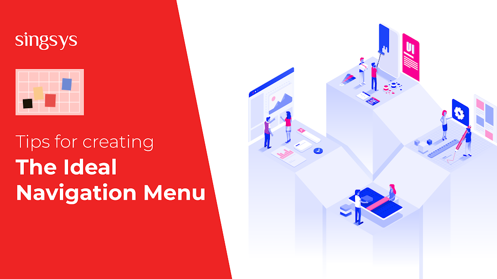
Tips for Creating the Ideal Navigation Menu
Now that you understand how beneficial navigation menus may be, let’s look at twelve great recommendations for creating one.
- Make accessibility a top priority
A well-designed website makes it easy for consumers to find what they’re looking for. That is, when a visitor arrives on your page, they should be able to swiftly identify and understand your menu:
the dropdown navigation menu has been styled
While you should be innovative, it is critical to prioritize developing an accessible website. As a result, avoid unclear or complex terms that may confuse readers. Instead, use plain typefaces, high-contrast colours, and straightforward wording.
2. Improve the User Experience (UX)
Providing a good user experience helps increase conversions and decrease bounce rates. To improve your UX, make your menu basic so that users do not have to learn complex processes. There’s a lot to be said for crisp, clean designs that make it easy for users to navigate your website.
It’s a good rule of thumb that customers should be able to get to where they want to go on your site in three clicks or fewer. That is why mega menus are frequently used on websites with a large number of content areas:
Design of a mega menu navigation menu
Large e-commerce stores typically utilize these mega menus since they make all pages accessible from a single location.
Your hosting provider is another issue that can have an impact on your UX. DreamHost offers high-quality shared hosting that includes customizable themes and essential plugins for all types of websites. We also provide user-friendly interfaces, as well as regular updates and 24-hour support.
3. Stick to Simple Designs
You could be tempted to overload your menus with effects to dazzle your visitors. Consider keeping the eye-catching components for your overall web design. Nonetheless, you may want to use graphics if they help with your navigation goals:
Example of a navigation menu’s active and hover states
Another alternative is to add relevant, helpful iconography to assist readers through your sections, such as directional arrows.
4. Include a search bar
Users looking for specific information may prefer to utilize the search option rather than scrolling and looking for anything manually, so make sure this feature is available on your website. The best location is at the top of the sidebar or in the header section, but it must also function properly. A search bar that produces no results is detrimental to your business! The search box should always return relevant results, allow for mistakes, and display related products and things.
5. Maintain Consistency
The format and appearance of your menu must suit the expectations of your visitors. Consider utilizing the same stylistic options to draw attention to menu items. Users will be able to tell when a link will take them to a new page or expand into a dropdown menu this way.
Benefit’s website, for example, employs directional arrows alongside links that expand into dropdown menus:
a straightforward mega menu with a call to action
It can also be useful to distinguish between primary and secondary headings. You may accomplish this by making top-level menu items somewhat larger or using a bold style to signal greater importance.
6. Create a Clear Hierarchy
Using a hierarchy in your menu allows you to divide the material into smaller sections. As a result, strive to combine pertinent information.
For certain websites, organizing information based on what is most popular or important to visitors might be beneficial. Then, within your menu, you can make these headings pop out. Strive to strike a balance between giving people pages of interest and directing them to pages that best serve your business objectives.
7. Don’t overlook your mobile users
Even Mobile navigation has different principles if you’re utilizing a responsive website design, where other aspects may be modified by default. Mobile users behave and engage differently than desktop users. As a result, the route must be designed specifically for mobile users.
Long top-nav bars, tabs, and complex sidebars can all have an impact on the primary content of the site. The dense interface of these types of menus is unsuitable for small screens.
Navigation menu mobile interface
The most efficient method for making your website navigation precise and readable on mobile devices is to use an expanding menu. You’ve probably noticed the hamburger icon () in the site’s upper right corner. These interface approaches are successful at providing users with more control over the interface.
8. Select the Appropriate Menu Type
There are many different kinds of navigation menus to consider. Dropdown choices appear frequently when you hover over or click on key categories. Then you’re shown a list of supplementary goods. These menus appear to be sleek and current. They’re also a wonderful strategy to save space:
- Design of a simple dropdown navigation menu-
You may take it a step further and create a whole mega menu. These are most suited for content-heavy websites because they can display all of your pages without being clunky:
Horizontal menus, which display major pages in a row fashion, are also popular. A vertical menu, provided in a column at the side of the page, helps readers browse because their eyes naturally wander down (not across) the page.
- Design of a styled sidebar navigation menu-
Vertical menus are a fantastic fit for websites with longer menu labels since they provide more space. They can, however, be eye-catching, making them an excellent choice for creative service websites.
9. Sprinkle with breadcrumbs
Breadcrumbs show viewers where they are in the structure of your site. Furthermore, they make it simple for visitors to return to the high-level pages that lead them to their current location:
Example of a sidebar navigation menu
Including breadcrumbs in your menu saves users from having to go back to the beginning. Instead, they can easily go back a step or two to discover what they’re looking for.
10. Include a homepage link in your logo
Keep in mind that every label in a navigation bar must be linked to a page. Flowery things on your website interface do not have navigation tabs, links, or utility buttons. Neither should your logo. As a result, include a homepage link in one of the top corners of your logo, which must be visible on all pages.
Even if the home tab is placed on the main menu, the logo should still point to it. In this manner, you gain one extra internal link to your homepage (which helps with SEO). This also makes it simple for users to copy your homepage link without even visiting it.
Conclusion
Navigation menu design is a crucial aspect of mobile app development. By following the top 10 navigation menu design tips mentioned in this blog, businesses can create a mobile app with a user-friendly and intuitive navigation menu. However, creating an effective navigation menu is just one part of the mobile app development process. It is crucial to work with a reliable and experienced mobile app development service provider to ensure that the app meets the client’s requirements and provides a seamless user experience.
About The Author
Shrishti is a skilled content writer who has been actively working in the field since 2022. She has a deep-rooted passion for assisting individuals and businesses with their online marketing needs. Apart from content writing, Shrishti also offers social media services to businesses of all sizes.
Related Posts...
Web DesignWebsite development
Jun 25th, 2026
The web development landscape continues to evolve rapidly, and businesses are constantly searching for ways to create faster, more efficient, and highly interactive web applications. One technology that has gained […]
Read more
Apr 14th, 2026
A website is no longer just a digital brochure. It is your business’s most valuable asset. It works 24 hours a day, seven days a week. It answers customer questions, […]
Read more
Sep 30th, 2025
The way businesses build and deliver digital experiences has evolved drastically over the last decade. In 2026, one of the most transformative approaches leading this evolution is headless web development. […]
Read more