Either it is an application or a website users mainly rely over menus to locate the content and use the features. The importance of menu makes them available on all websites or in an application. As every menu is not designed equally which might lead to confusion hence, sometime are not smooth to deal with.
Basically, the navigation inside a website helps the user reach a destination within the website.
Let’s consider the menu of Apple website.

image credit: apple.com
Apple being a global leader in design so the website is equally well crafted to beautifully display their products. The main navigation menu enables the display of every product in a fun sliding animation for respective products when a section is selected. Their approach to show every product using high quality relevant images helps user to easily locate a particular product.
The following parameters are important to consider while designing a user oriented menu for hassle free and delightful experience.
1. Menu Visibility
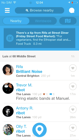
image credit: uxplanet.org
A Hamburger menu (three-line menu) icon can be tricky sometimes as it hides the entire navigation behind it. Now though it is doable option for small screen device but, they are really not that user friendly as user will have to tap to look into underlying option and further choose one.
The logic is simple what is not visible actually becomes less obvious. Therefore, proper exposure of the menu options will surely boost engagement rate. This is also an obvious reason behind YouTube mobile applications have turned down hamburger menu option and switch to a menu where important navigation options are clearly visible for user to interact and further engage.
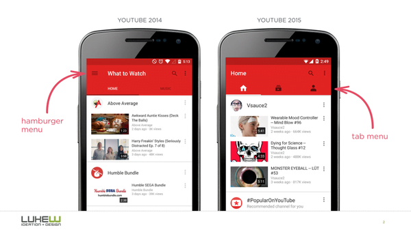
image credit: uxplanet.org
2. Current Location of User
When user is browsing through a website or an application for quite some time it is likely he will be stuck in a situation where he will try to find an answer to the question, “Where am I?” to further navigate successfully. Mostly, user rely on helpful menus to locate themselves.
Icons: Users are well aware of universal icons of search, email, print and others but these are quite limited.
Colors: Present state can be properly represented in the tab bar on-behalf of contrasting colors and appropriately selected labels.
I would recommend to employ best suitable icons and supporting colors to make user better understand his current location. In this manner the usability of the icons can be enhanced and serve the purpose.
3. Menus and User Tasks Coordination

image credit: uxplanet.org
Link labels that are easily understandable are highly beneficial and always recommended. After deep analysis of what user is looking for and accordingly usage of proper category labels which are familiar and relevant with the target audience ensure a balance between user task and menu relevancy. The key towards impactful menu is sticking to the terminology that clearly specifies the purpose, feature and content of the menu. Users will really appreciate when they can easily handle specific task inside an application. This will substantially reduce the amount of time that could have been unnecessarily spent on understanding the menus.
When menu elements can be easily scanned it will enable user to comprehend what exactly will happen once they tap on an element menu.
4.Easy Menu Accessibility
Either menu elements are too tiny or they are too together in both the scenarios it will be an irritating experience for app users. Sufficiently big menu can be tapped and clicked in very first try. Average width of human index finger is in range of 1.6 to 2 cm for majority of users which converts to 45-57 pixels. This much wide touch space lets the user finger to most comfortably fit on the target and generates accurate visual response reflecting the fact that target is hit correctly.
Menus with finger-friendly design are key to improve the app as well as mobile usability for all users.
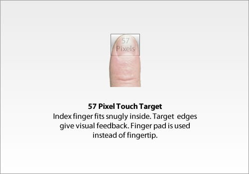
image credit: uxplanet.org
5. Smartly Managing Menu with Huge Number of Different Categories
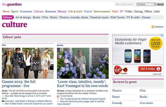
image credit: creativebloq.com
Have a look at the above image. I think the Guardian newspaper’s website contains a very large number of various categories and they are further divided into appropriate number of sub-categories.
Here the main focus has been onsmart design to enable smooth and quick navigation for all categories and sub-categories by making them easily accessible and highly intuitive. Although there are multiple sub-categories present yet they are simply 2 click away from any webpage of their website.
Moreover, every category is properly represented with an appropriate color to maintain a pleasing visual difference.
Conclusion
Helpful navigation of a website or an application is utmost important favorite during menu design phase. The approach should be to strike a balance between user navigating habits and menu organisation. The bottom line is design is for users if they can easily locate and learn about your product the more chances they will end up buying the product.
Looking forward to your comment and query regarding importance of designing mobile apps menu meaningful and user friendly.
A user-oriented solution on cutting edge technology to engage customers or boost your brand to eventually edge out your competitor and realise the potential and importance of latest online business solution in various domain to ensure stability and rocket sky the ROI. Singsys boasts best-fit developers, designers that were key to partner with multiple Fortune 500 firms to deliver industry oriented web, mobile and e-commerce solution always.
Related Posts...
Mobile Apps
Jul 7th, 2026
The rapid growth of digital payments has transformed how businesses and consumers manage financial transactions. Whether you’re ordering food, shopping online, paying utility bills, or transferring money internationally, secure digital […]
Read more
May 7th, 2026
If you run an online store—or plan to start one—you already know the truth: everyone is on their phone. In 2026, if your business isn’t on a mobile screen, it’s […]
Read more
Apr 30th, 2026
Mobile apps are handling more sensitive data than ever before. From personal details to financial transactions, users trust apps to keep their information safe. That’s why security is no longer […]
Read more